Marks & Spencer
Brand Refresh
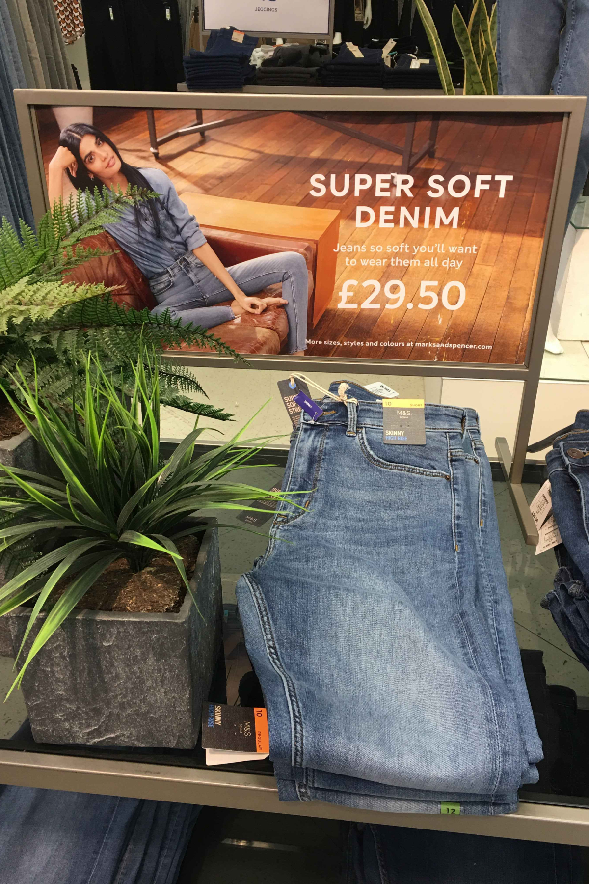
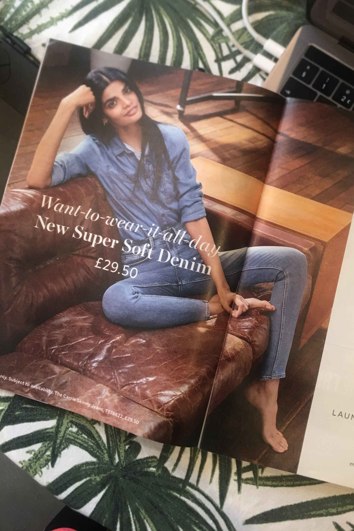
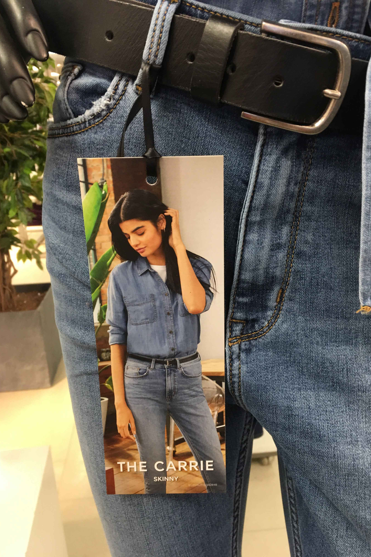
Working intrinsically with the teams at M&S Home and Clothing to create the brand books for categories of Women’s, Men’s, Kid’s, Lingerie, Beauty, Home and Furniture. Including sub-brands (Per Una, Goodmove, and Autograph), that hold a differentiated aesthetic from the M&S Masterbrand. All the above gives a unique personality and establish a differentiated position in the market that drive commercial gain through tone of voice, image style, typography, iconography, store, and online principles. Every principle was then comprised within the brand guidelines to enable every department to follow. Coinciding with the brands store renewal in Manchester to establish a new refreshed look and feel for all stored in the future.
www.marksandspencer.com
BRAND REFRESH • ART DIRECTION • DESIGN • TEAM CURATION
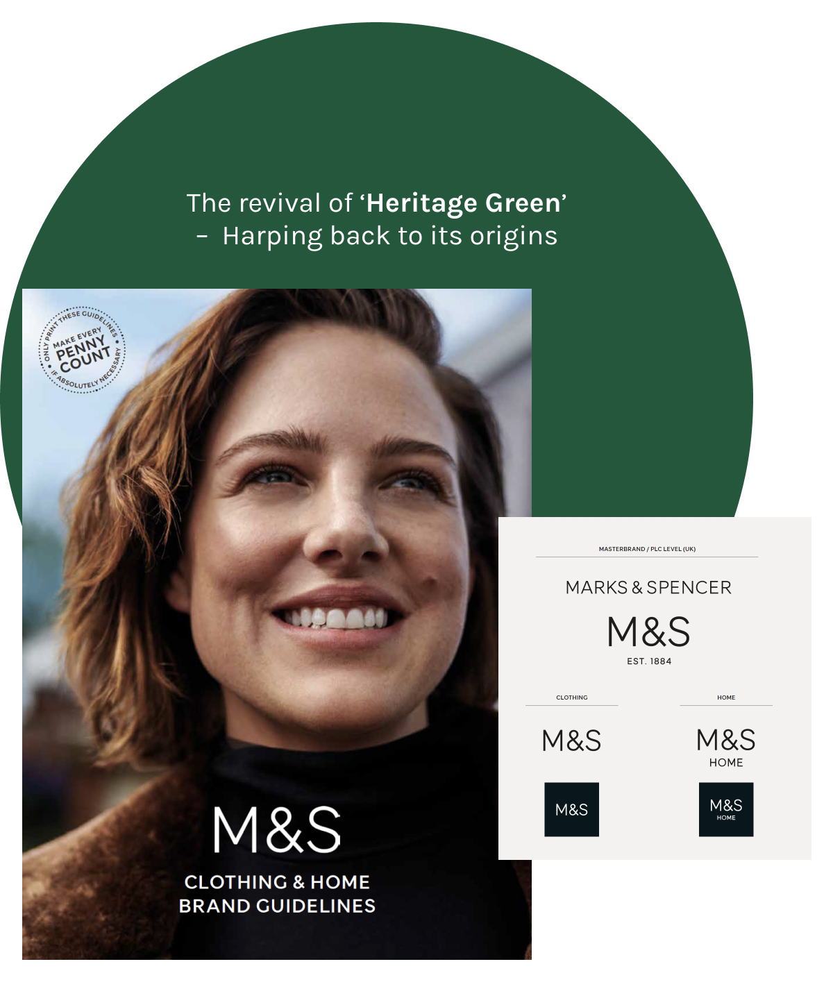

Principles with Style
The main role of the imagery is to make the product desirable and up its style credibility across the board. All imagery reflects the brands personality golden thread – the ingredients that make up the DNA of the brand. Creating a set of creative principles to follow for every category across every touch-point to achieve a consistent brand experience.

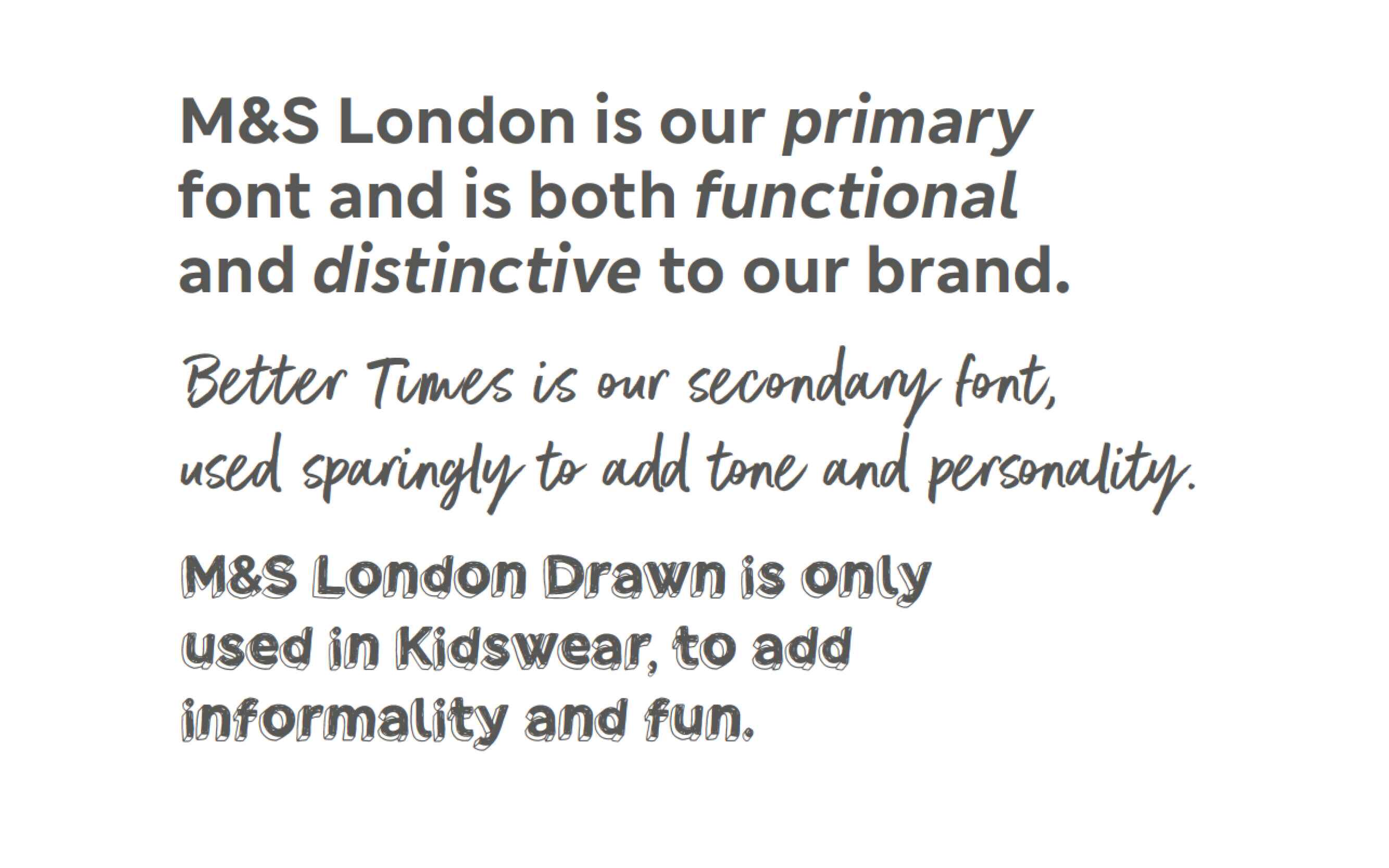
The Role of Type
Focusing on one main font: a hard-working sans-serif font used to carry the bulk of our messaging. The exceptions to this are the hand drawn version, which used across Kidswear communications, and then the script font, a sparingly used font occasionally used in a campaign where we are playing up our ‘Jester’ archetype, and being more whole-heartedly entertaining, such as in a Christmas campaign. Setting clear and simple font uses helps build personality and understanding internally and externally to the customer.
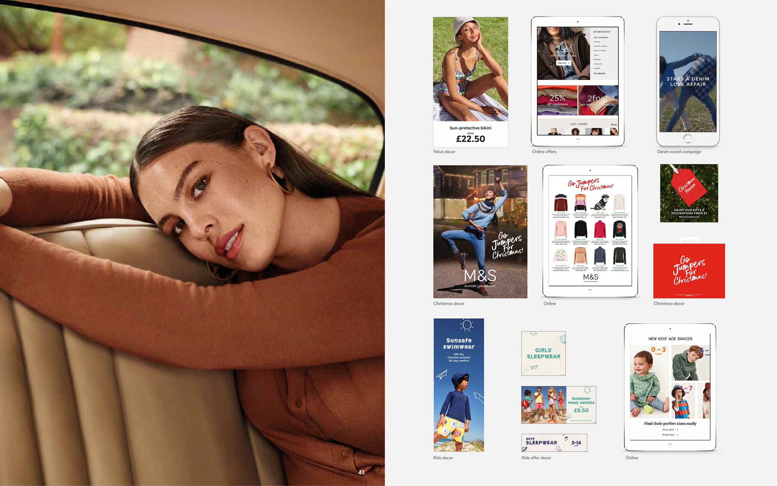

The role of Icons
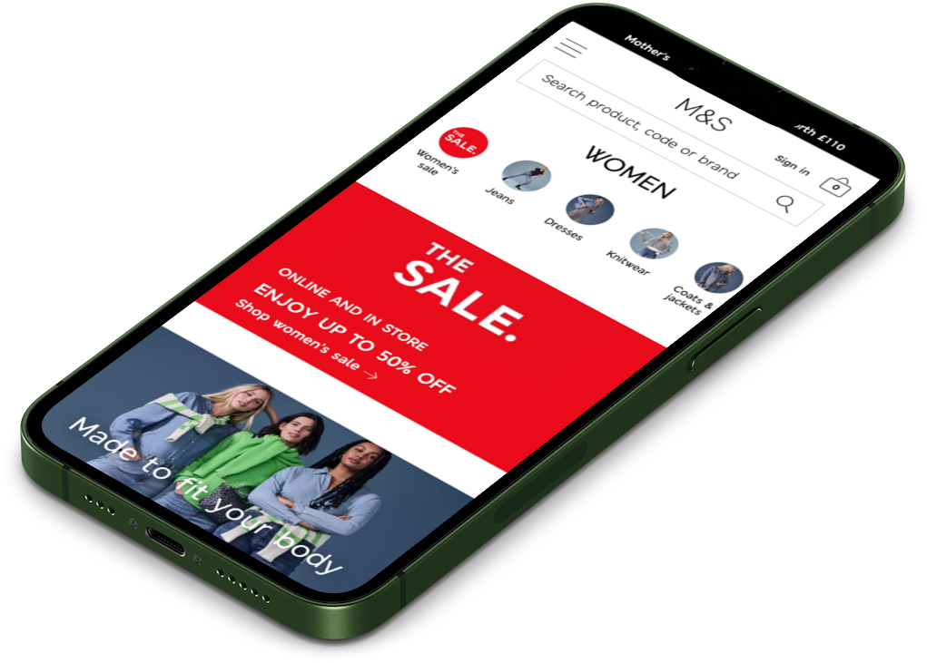
I believe that M&S's iconography is intrinsically connected to the brand; the icons should have an ownable personality which maximises recognition and does not conflict with a campaign and product photography. I pitched to the board and gained the green light to work with the in-house team to create a unified global language to communicate across all touch points, from mobile devices to large-scale outdoor sites.
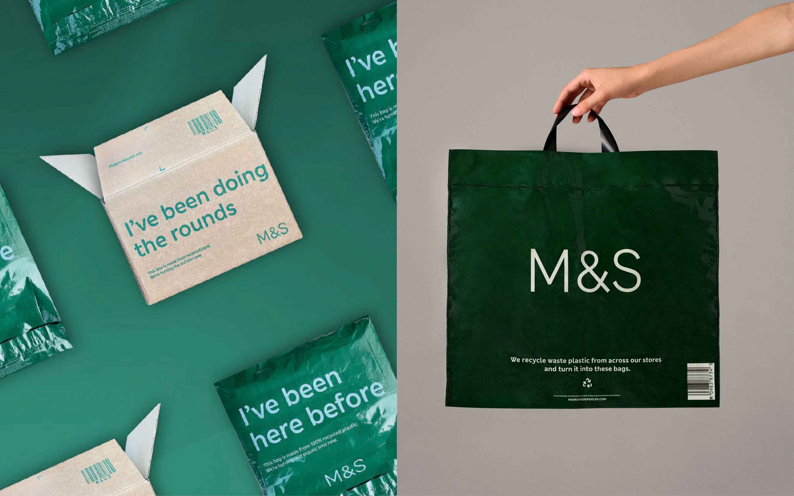
Recycled carrier bag
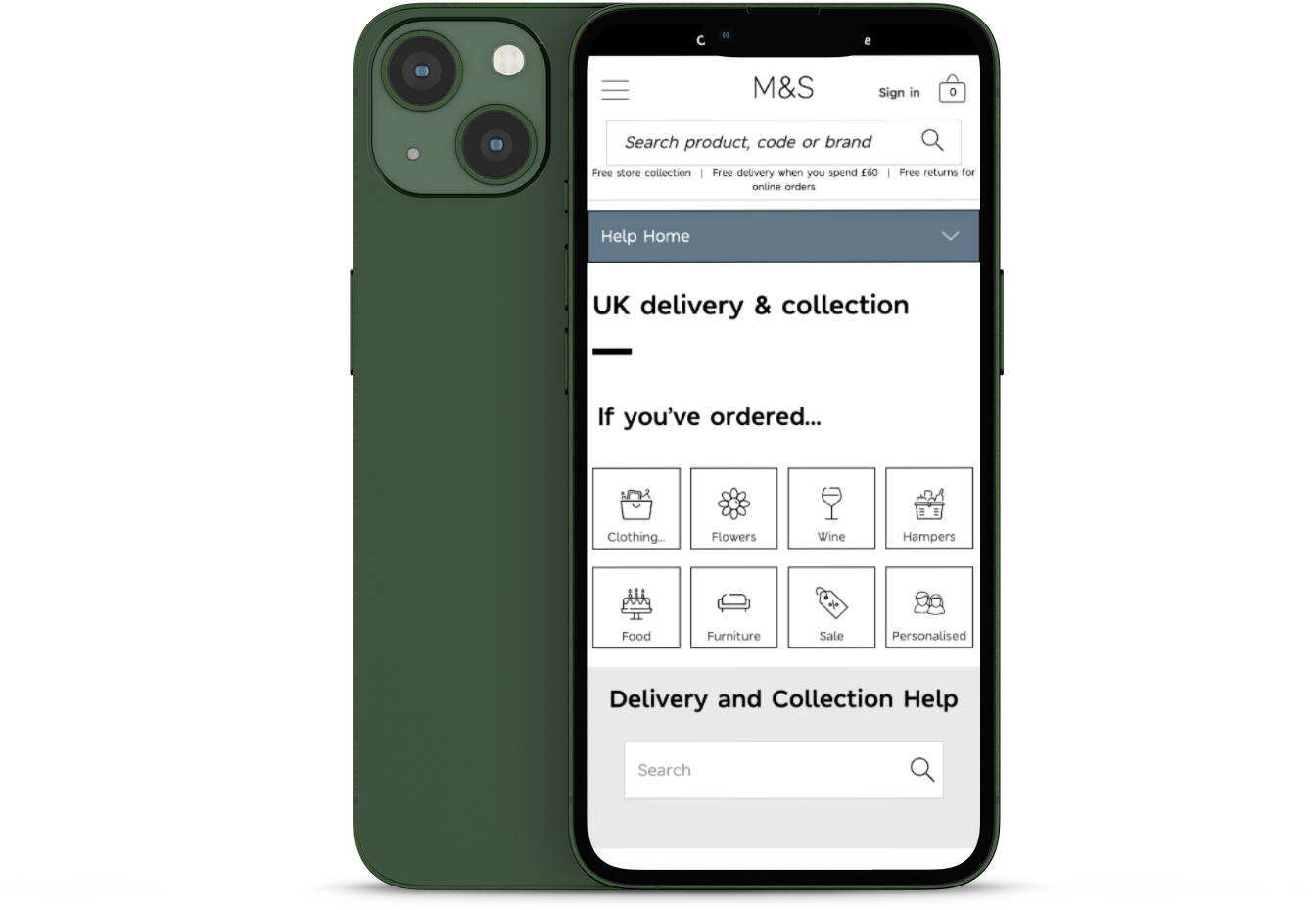
With the importance of reducing the use of plastic and encouraging customers to use fewer bags and reuse the bags that they already own, we were briefed to redesign carrier bags and online packaging. Messaging and colour were two core design elements at the forefront, reflecting the brand positioning; value and sustainability, plus the change of material being much friendlier for our environment. The old core palette features black and white. Stepping forward and in line with the store renewal, we embraced a modern take on the heritage green that M&S was so famous for so many years ago.
